
SWEET DILL / 0 → 1 AI COMMERCE
Reducing shopping friction without reducing user agency.


Role
Sole AI Product Strategy & UI/UX Intern
Owned
Product strategy, end-to-end design, customer-facing UI, brand system, go-to-market
Tools
Figma, Cursor, Vercel
Timeline
June 2025- March 2026
01 / outcomes
Put faster shopping decisions in the hands of 3,000+ users in 3 weeks.
One verdict instead of five tabs
Sweet / Meh / Sour verdicts compressed fragmented shopping research into an actionable decision.
Top 14 on Product Hunt · 5★ Chrome rating
Early external validation after launch.
Shipped
Brand system · Chrome extension & Store listing · Marketing site · Deals marketplace · Creator pages · Investor materials · AI app (end-to-end UX)
Deal-Analyzing Chrome Extension

Deals Marketplace
AI App Shopping Assistant

A lo-fi interaction map connecting Sweet Dill’s core user flows before high-fidelity design.
02 / Context
Sweet Dill is an AI shopping platform that finds the right product at the right price at the right time across three surfaces
[Chrome Extension]
“Is this a good deal?”
Analyzes prices, reviews, alternatives, and deal timing to help shoppers buy confidently.
[Marketplace Website]
“What’s worth buying right now?”
Marketplace website that surfaces high-value deals, compares retailers, and helps shoppers discover what’s worth buying.
[AI App]
“What’s right for me?”
AI shopping app that learns preferences, guides decisions, and recommends products tailored to each shopper.
03 / PROBLEM
I joined in week three and built Sweet Dill’s customer-facing experience from scratch.
There was almost nothing to inherit: the website was AI-generated scaffolding, the app didn't exist yet, and no visual system held the company together.

04 / research
People want less work, not less agency.
“I don’t need you to pick the best shoe. I just need you to help me undestand which one’s best for me”
“If [Sweet Dill] gave me a list of things or options, I would like it because I want to still have the power to choose what ot buy.”
After conducting over a dozen interviews, I came to the question:
How might we automate the work around a decision without automating the decision itself?
Most common questions people ask while purchasing a product.
I realized that each section of the Chrome Extension interface should answer the shopper’s next question.
Why should I pick this product?
Can I trust this product?
What is the cost of ownership?
Is this a good deal?
Why should I buy now?
What do other options look like?
After a dozen interviews, one question emerged: how might we automate the work around a decision without automating the decision itself?
I mapped the six questions behind every purchase. Platforms like Amazon and TikTok Shop answer the first three: pick, trust, cost. Nobody owned the last three: deal, timing, alternatives.

05 / PROCESS
I risk turning pages into financial dashboards.
Studying Honey, CamelCamelCamel, Slickdeals, Woot, and SimplyCodes, I structured the extension by hierarchy: deal verdict first, supporting evidence one click away, deeper alternatives after that.
I put the deal verdict first and kept supporting evidence one click away.

Overly-complex extension (competitor example)

I kept the most necessary information, while making additional details hidden but accessible.
06 / AUTOMATION
Because Sweet Dill could test coupons automatically, I removed the promo code list.
The founder wanted codes visible and browsable: a coupon tool inside the deal finder.
I pushed back: product and checkout pages are separate, so attached codes go stale; and automatic testing was already our value proposition. The cleaner extension shipped at launch.


07 / BRAND + LAUNCH
I built a brand that made deal-checking feel trustworthy, steering away from a sketchy coupon tool.
I rebuilt Sweet Dill’s brand to feel trustworthy without becoming sterile or coupon-y. I unified typography and color, explored dozens of mascot directions, and studied approachable brands like Duolingo and Phantom.

Old Mascot
Salesman posture
Exaggerated expression
High visual detail
Generic AI rendering
Static non-scalable illustration

New Mascot
Straight posture and rounded form conveys trust, predictability, and approachability
Calm and friendly expression
Simple, recognizable silhouette
Part of a larger design and communication system (Sweet, Meh, Sour)


Listing Page Graveyard
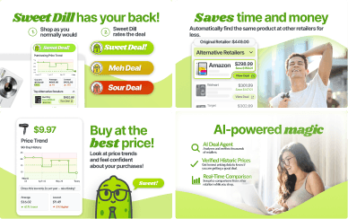
Four rounds of Chrome Store listing critiques taught me when to abandon polished work. The final version shipped at launch.
08 / adding more to the ai ecosystem
My job shifted to turning a moving product into something useful and understandable.
Paul, the founder and my employer soon wanted Sweet Dill to enable the following experiences for our users.
Experience 1
[Chrome Extension]
Evaluating product someone already found.
Experience 2
[Marketplace Website]
Enable users to discover products with good deals.
Experience 3
[AI App]
Recommend products specifically tailored to user’s shopping needs and habits.
Price verdict
Product embedding
Price history
Review scraping
Price analysis
Promo code finder + tester
Alternative retailers
Product matching


As the chrome extension was being built, an intelligent data layer began to form. My work expanded into integrating the intelligent data layer to support all three experiences.
Shared Commerce Intelligence
prices / alternatives / price history / promo codes / product matching
Chrome Extension
Marketplace Webiste
AI App
09 / MARKETPLACE
I turned the same commerce data into a marketplace for discovering deals.
The extension only worked once someone had already found a product. The website started one step earlier: what is worth buying today?
I worked with engineering to understand how collected product data entered the system and how live fields mapped into reusable components, so the design would survive real data rather than clean mockups.
10 / ai app
I replaced the blank chat box with guided questions that helped shoppers form their intent.
The plan was a chatbot for personalized recommendations. But interviews across six categories showed messy journeys: some shoppers knew exactly what they wanted; others triangulated reviews, social, friends, and AI; some just browsed.
A blank prompt assumes the user knows what they want, offloading the hardest part of shopping back onto them.
I redesigned the app around contextual starting prompts and category-specific follow-ups, constructing intent with the shopper while preserving comparison, rejection, and exploration.

What I was given

My redesign
11 / working in a startup
I picked up skills fast and dropped dead-end production even faster.
Working in an early-stage startup meant I working with and taking on roles outside a UI/UX designer.
I focused app fidelity on novel behaviors while documenting intent for engineering, built an investor landing page overnight and supported fundraising decks.


12 / reflections
Sometimes subtraction is the greatest addition: abandon finished work when the premise is wrong, remove interfaces instead of adding features, compress dense intelligence into one judgment.
Working beside the founder every other day on pitch decks, market research, brand direction taught me to think beyond screens and think like a product owner.
What I want next is to move further upstream: to frame the problem myself, build the rationale, and own it through implementation.